Fergus Falls, MN – The new logo for Fergus Falls has begun to rollout across the City’s various digital platforms.
The logo was approved by the Fergus Falls City Council back in April, with the plan to implement it digitally by June 1st and gradually implement it physically across town as funds become available.
On September 5, 2023, the City Council approved the communications plan, which includes a logo refresh and branding guidelines.
The former logo was designed in the early 1990s through a community contest for the city’s tourism work (which was then handled in-house).
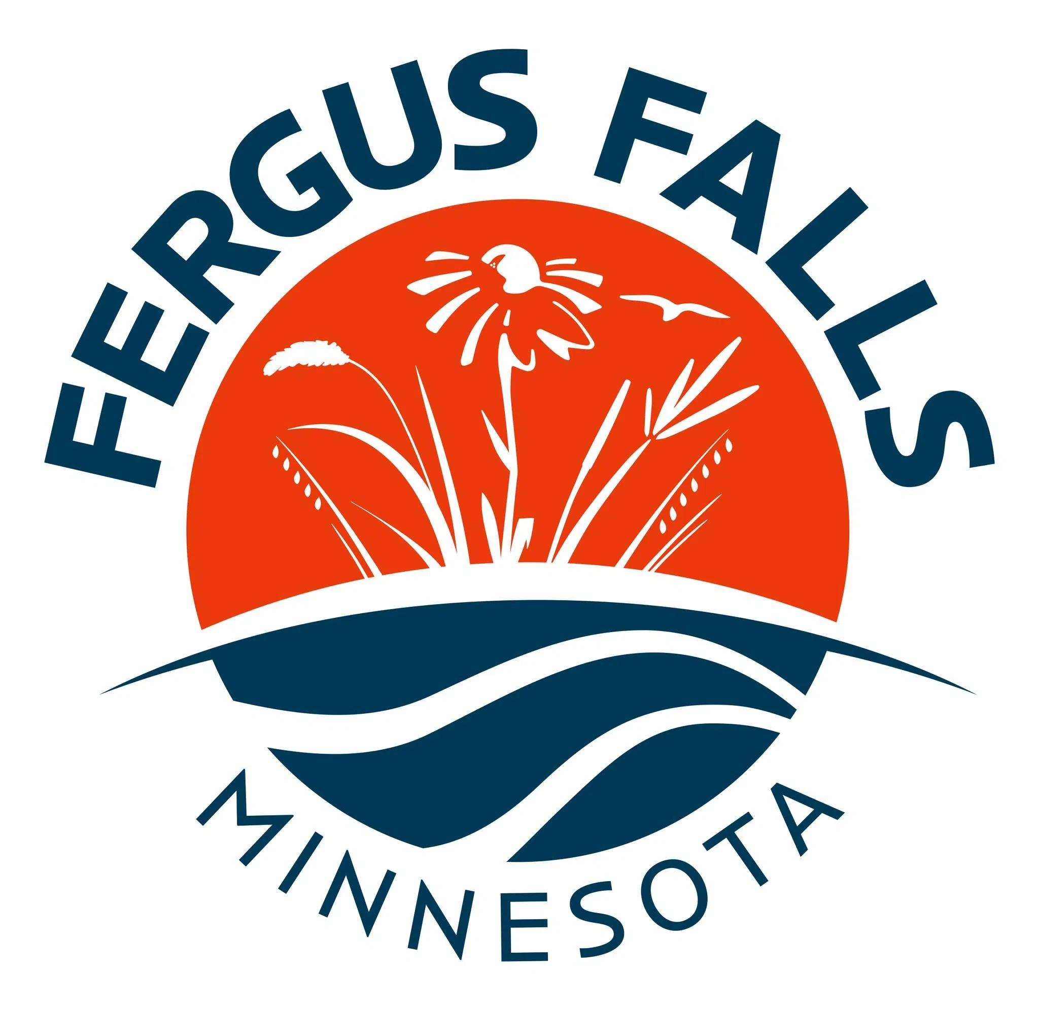
The logo builds on the three “waves” and uses dark blue, reminiscent of the previous logo.
These “waves” can generally depict water, waterfalls, the river or even a road or journey.
The lower half suggests forward motion, action, momentum.
Blue is associated with knowledge and reliability.
The top portion, the prairie flowers, and grasses (and a bird) provide a sense of identity and place-making.
Orange is associated with energy, welcoming and liveliness.
During the design process, City department heads provided an inventory of places and things that would need the new logo.
Things like the water tower, business cards and all electronic elements will eventually incorporate the new logo, but this will occur gradually as funds are available.